App Design
My Role
Tool & Method
UIUX Design
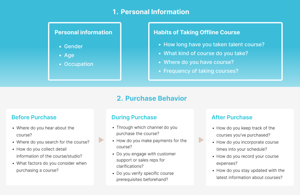
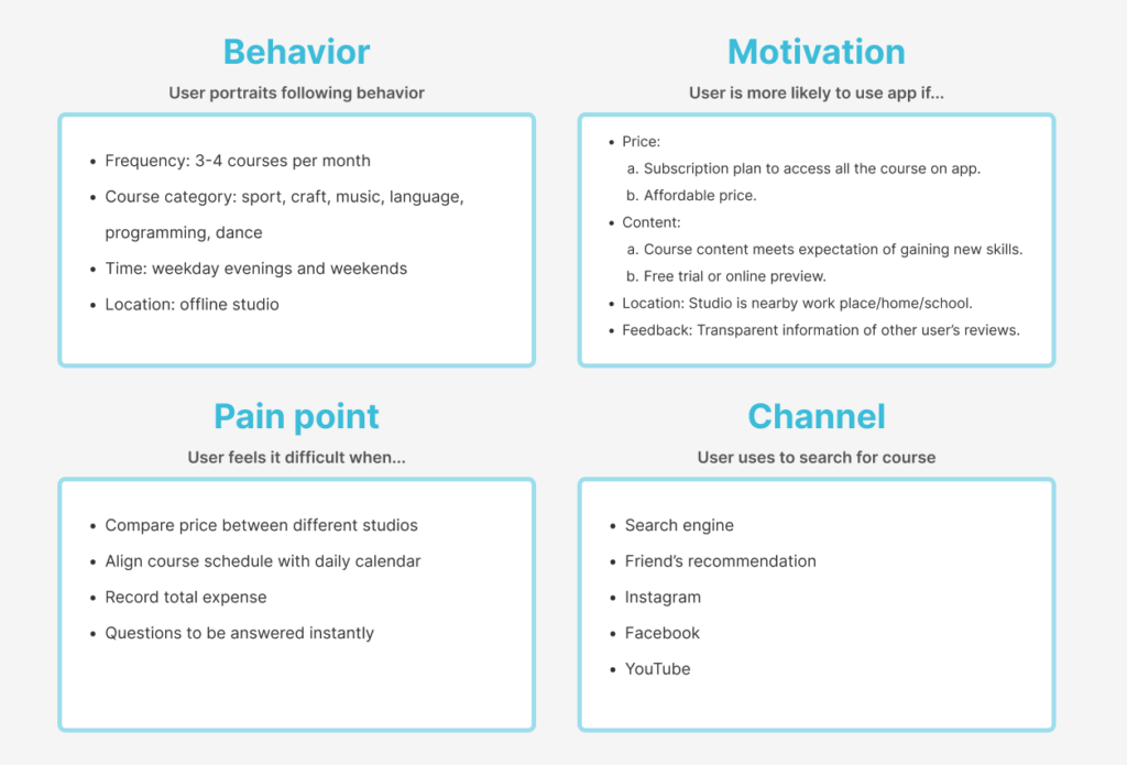
Focus Group Design
Figma
Whimsical
Project Overview
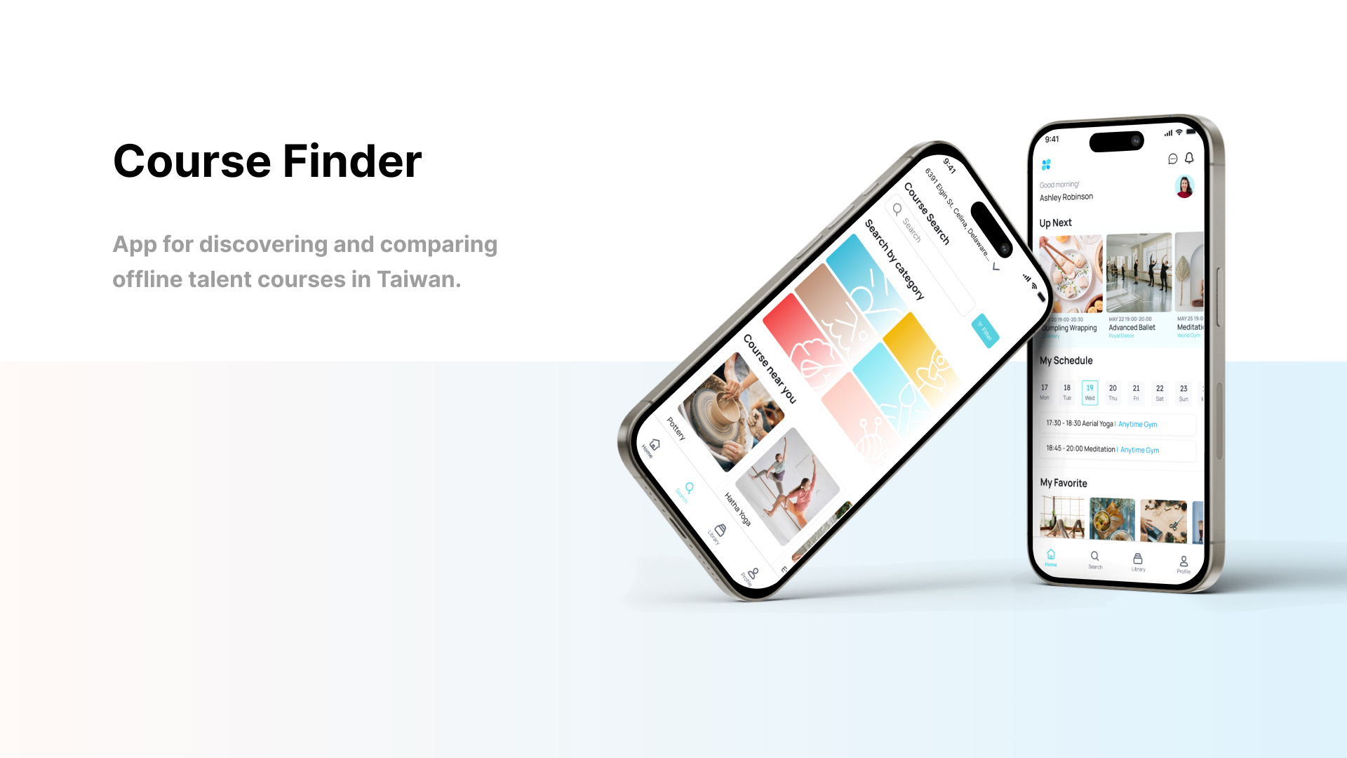
Course Finder is a centralized platform designed to simplify offline course discovery and booking. With a focus on personalization, transparency, and an engaging user experience , it empowers users to explore new skills and hobbies with ease.
Problem Statement
01
Fragmented Information
Users need to gather course details from multiple platforms such as social media, Google Maps, or friends’ recommendations, making effective comparisons difficult and wasting considerable time.
02
Lack of Transparency
Incomplete information about course quality, instructor credentials, and user reviews reduces trust and confidence.
03
Barriers to Exploration
Existing platforms do not offer simplistic recommendation systems, failing to provide personalized suggestions aligned with users’ interests and learning goals.
Market Opportunity
Competitive Analysis
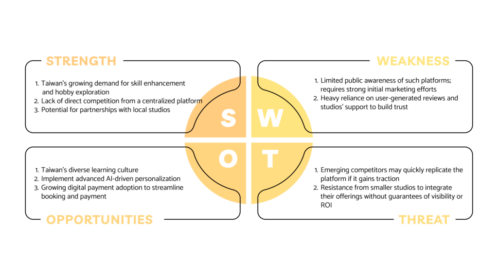
Taiwan Market- Existing Players
Pinkoi Experiences
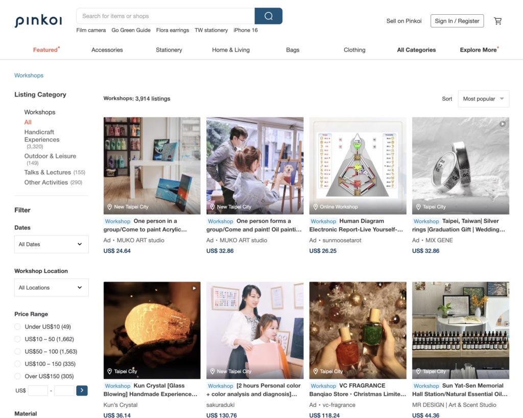
Only focuses on handicraft workshops, which lack comprehensive course options, advanced filtering, and personalized user experiences.
Global Success Cases
CourseHorse (USA)
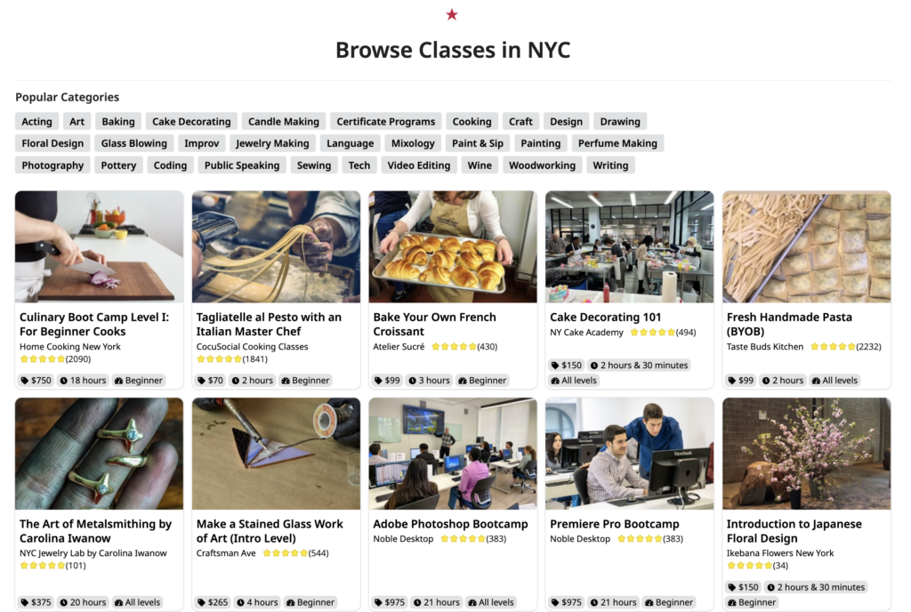
Integrates various offline learning opportunities into one platform, focusing on ease of use, detailed course information, and tailored suggestions based on user preferences.
Street Academy (Japan)
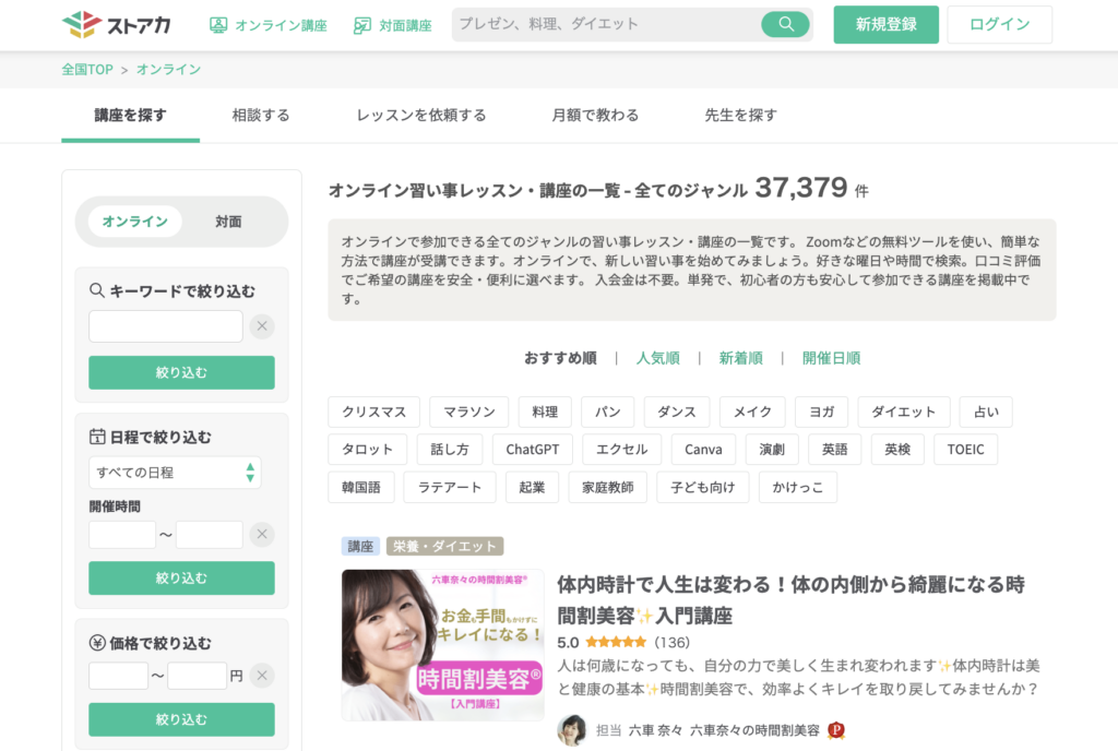
Offers a centralized marketplace for offline classes, combining transparency, user reviews, and seamless booking. Its success stems from clear course categorization and personalized recommendations.
Goals & Core Features

Personalized Course Discovery
Users can find suitable courses based on their specific demands, such as distance, price, content, and teaching resources.

Detailed Course Information
Users get to know the course well through detailed introductions, including studio-provided materials and other users’ reviews.

Seamless Booking and Payment
Users can easily reserve and pay for courses through a streamlined and user-friendly process.
Business Value
- Subscription-based premium features for users
- Service fees charged to studios for bookings
- Data analytics tools offered to studios for tracking
Revenue Streams
Platform Growth
- Meet the demands of untapped user segments
- Builds a competitive edge through features like surprise course discovery and advanced personalization
Combined Success
- For users: Personalized recommendations and efficient booking improve satisfaction and loyalty
- For studios: Enhanced exposure and increased course enrollment.
- For the platform: Sustainable profitability and strengthened market position
Success Metrics
01
Number of courses booked
02
Percentage of repeat users
03
Average user satisfaction rating
Ideate
Information Architecture
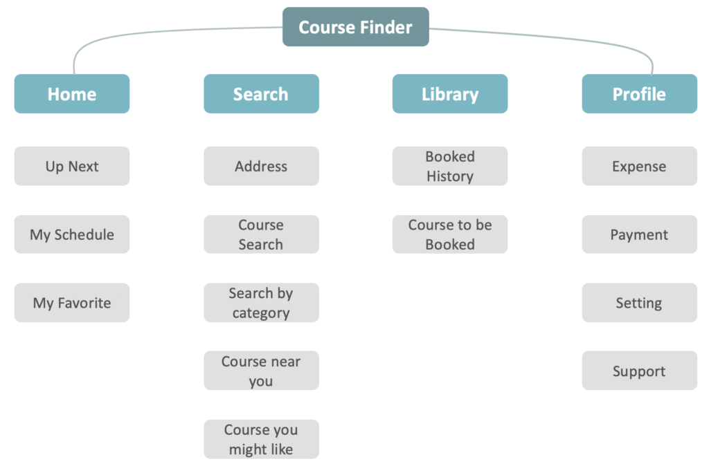
Based on users’ feedback and identified needs, I began working on the app structure, aiming to make it simple and intuitive to use.
It’s divided into four parts:
- Home Page: Functions as a schedule reminder.
- Search Page: Displays multiple selections.
- Library Page: Contains purchase details and a save list.
- Profile Page: Includes personal details.
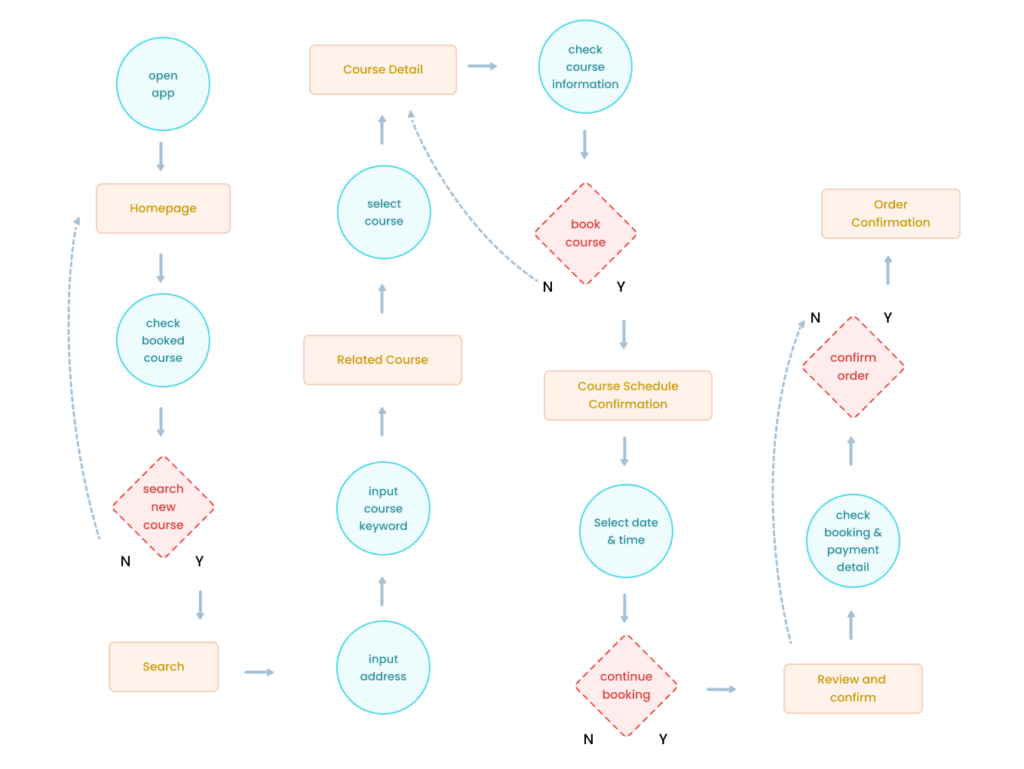
User Flow
Wireframe
Prototype & Design Concept
Sign-in
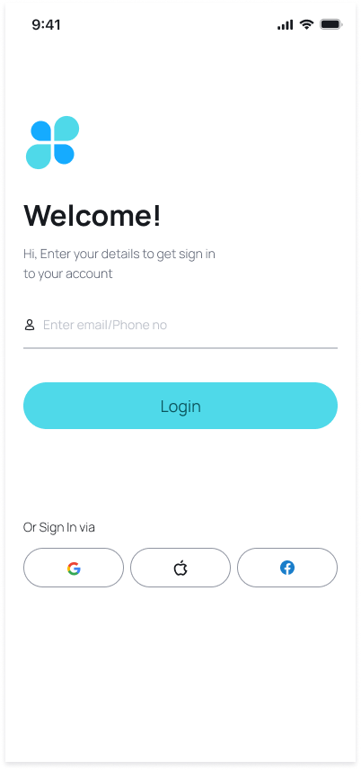
As this is a learning app designed for people to discover courses, the brand image should be bright and vivid to spark users’ interest and foster a positive learning experience. Therefore, I have chosen green and blue as the theme colors to dynamically convey a sense of energy and creativity.
Green symbolizes growth, energy, and vitality, capturing the essence of dynamism and enthusiasm.
Blue represents depth, wisdom, and imagination, highlighting the boundless creativity and innovative spirit.
Together, these colors create a vibrant and inspiring visual theme that embodies both the energetic drive and creative brilliance.
Homepage
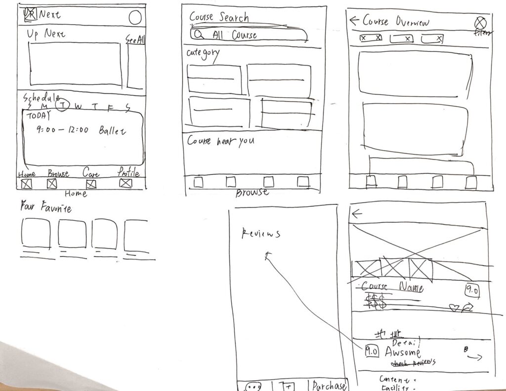
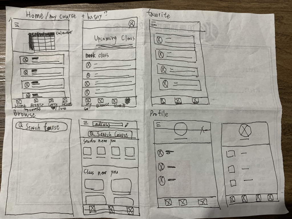
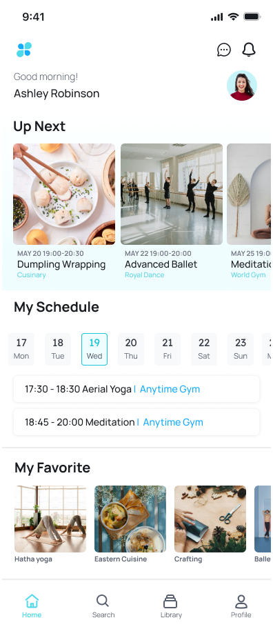
To meet the demand from interviewers for an overall view of upcoming classes and to enhance the accessibility of information from preferred courses, the homepage is divided into three sections— Up Next, My Schedule, and My Favorite.
Up Next
This section provides a quick overview of the next upcoming courses or events the user is enrolled in or interested in. It includes essential details like the date, time, and studio name of each course, allowing users to easily see what’s coming up soon and plan accordingly.
My Schedule
Allow users to review their course schedule by week. Each square in the weekly view is clickable for further details, this organized view helps users manage their learning commitments effectively.
My Favorite
This section contains a list of courses that users have marked as favorites or is interested in. It acts as a bookmark for easy access to information about preferred courses, enabling users to quickly find and review details about the classes they are considering or planning to enroll in.
Search Course
01 Distance is the vital factor influences users’ choice of course
Users insert address information on the top of Search page, providing them with the choices of nearest course.
02 Some users know exactly what type of course they are looking for
Users can easily select a category and the system will display related courses.
03 Since distance is the vital factor, input-address generates course recommendation
Based on the address users provided, system will display nearby courses to reduce search time.
04 Utilize historical data for precise targeting
According to users’ browsing & booking history, system will provide contents with high similarity that users might like.
Search Result
Key Component:
- Filter
- Overview of
- Rating/Reviews
- Price
- Location
- Course Introduction
- Special tag
- Save to Favorite
Course Detail
01 Media/Course Name/Price
Place the most important information in the first block:
Photos and videos offer users a first impression and an opportunity to learn about the course without an in-person visit. The course name is essential, the price is a critical factor for users, and special tags serve as decision-making guides. Therefore, include all of these elements in the first block.
02 Studio Information/Location
Users can click on the studio name for additional information, including other courses offered by the same studio.
The location is also displayed with a map view linked to Google Maps, allowing users to efficiently confirm the location.
03 Course Introduction
Represent more information about the course, including teaching resource, course content, common Q&A, and etc.
04 Course Review
Reviews from other users are a crucial element for newcomers to assess and evaluate the course.
Booking & Payment
To precisely meet users’ demands, bookings and payments can be made per class rather than for an entire session, reducing users’ pressure.
1. Click “Book Course” button
2. Choose date & time
3. Insert payment information
4. Review Booked Detail
Profile and Expense
Profile includes Expense, Payment, Settings, Support
To meet users’ needs for tracking course expenses, the “Expense” section allows users to set a target total expense and record current expenses, giving a clear overview of their spending habits.
Validation
Validation testing is conducted with 6 participants interviewed.
Below are the summarized feedbacks from participants:
- 16% of participants was curious about the “UP NEXT” section on Homepage, not sure whether is the booked course or the recommendation course for booking.
- 18% of participants was curious about the “address editing function” on top of Search page, being curious about the relationship between address and course searching.
- 12% of participants were confused about the the “Check Booked Course” button on Booked Detail page, they’d like to check course detail information but the button leads to Library.
- 33% of participants were confused about “To be Booked” on Library page. It was originally designed to save items to the favorites list.
Afterthought
After completing the Google UX Design Professional Certificate, I began working on my first UX project. Due to my limited experience, the entire process took longer than I had anticipated. The most challenging parts and how they could be improved are summarized as below:
01
Vague User Feedback
I struggled with uncovering the core issue during focus group interviews because users often expressed vague problems. In the future, I will extend discussions and ask deeper questions to reveal more critical insights and address the real problem.
02
Misaligned Features
I sometimes lost focus on the problem statement, leading to designs that didn’t solve users’ issues. Moving forward, I will keep reminding myself of the product goals to ensure features align with user needs.
03
Prototype Revisions
I repeatedly adjusted the prototype without clear direction. In the future, I will create more wireframes beforehand and use them for preliminary testing to refine the design more efficiently.

